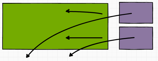
Earlier I said I was going to have a crack at making the theme I use for Pixieland a little more responsive and you know what? I actually did it.
Clunky and coarse, yes, but now if the page width drops below the previous minimum of 960px things will get out of the way and let the width drop sanely to the content minimum of 640px. It actually looks kind of OK too, though I’m sure I’ve missed some inevitable side-effects of being a bit over-zealous with the CSS selectors I’ve overridden.
Below is the CSS I added to the end of the main style sheet. There are undoubtedly a hundred better, neater, more elegant ways to do it but with my limited experience of WordPress styling and only Chrome developer tools to help me, it works pretty well:
@media only screen and (max-width: 960px) {

	body {
		min-width: 640px !important;
	}

	/* Header image */
	div.container_header_top div.grid_11 {
		width: 300px !important;
	}

	/* Top menu */
	div.grid_16 {
		width: 640px !important;
	}

	/* Search box */
	#head-search {
		float: left;
	}

	/* Main content */
	div.container_16 {
		width: 100%;
	}

	/*Sidebar */
	div.grid_5 {
		width: 100% !important;
	}

	div#sidebar div.widget {
		float: left;
	}

	div.widget-wrap.widget-inside {
		width: 130px;
	}
}
[The banner at the top, by the way, was made using the inestimable Balsamiq. So much fun.]
