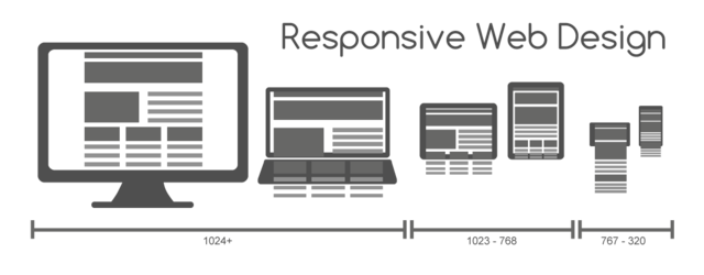
Responsive design. You can’t go anywhere on the internet without tripping over the term. And what a wonderful thing it is. Using modern CSS and Javascript techniques to let the same site reflow its content to fit different window sizes, growing and shrinking, showing and hiding as needed. It makes for some truly slick sites and, perhaps more importantly, reduces the maintenance effort by having less code and design to maintain since you no longer have to have separate sites for different sizes and devices – at least not to the same extent you’re used to.
But how does it work? That’s what I wanted to know, and this article is the fruits of my – admittedly lazy – research. A simple style sheet for a bare-bones responsive page.
Simple yes, but it turns out that once you peel back the complexities of the sites and the designs themselves, the techniques for dynamically reflowing a page are relatively straightforward.
Here magic happens
The core of it is in using blocks of CSS specific to screen widths that match certain constraints. For example:
	@media only screen and (max-width: 1024px) and (min-width: 641px) {
		p {
			font-size: medium;
		}
	}
And that’s it. That there is the voodoo, the secret sauce, the black magic. The CSS defined within that block will only be applied when the screen width is between 641 and 1024 pixels, dynamically applying styles to your markup as the size of the page changes. This technique can also be applied at the link-level to import entire stylesheets for certain sizes:
    <link rel='stylesheet'
          media='screen and (min-width: 641px) and (max-width: 1024px)'
          href='styles/medium.css' />
So with this in mind, I present the following exercise in CSS simplicity:
div {
    margin: 0;
    padding: 0;
}

/* Large screens */
div.fullCol {
    width: 100%;
}

div.halfCol {
    float: left;
    width: 50%;
    margin-left: auto;
}

div.thirdCol {
    float: left;
    width: 33.3%;
    margin-left: auto;
}

div.thirdCol:last-of-type {
    width: 33.4%;
}

/* Medium Screens */
@media only screen and (max-width: 1024px) and (min-width: 641px) {
    div.halfCol {
        float: none;
        width: 100%;
    }
}

/* Small Screens */
@media only screen and (max-width: 640px) {
    div.thirdCol, div.halfCol {
        float: none;
        width: 100%;
    }
}
Et voilà
With a little colouring and content added for illustration, you get the following:
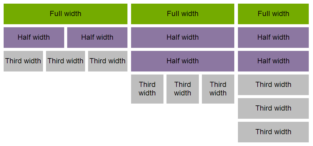
Click for bigger or see it in action.
Like the meercat says…
Simples. If you’ve done this before you’ll find this example to be really basic stuff. But that’s somewhat the point. If like me you’ve never tried it and assumed it was complicated black magic you might be surprised at how straightforward the basics are.
Next challenge: see if I can’t crowbar some responsiveness into Pixieland’s theme…