Tag Archives: Responsive

Success! Responsive goodness

Chiron Responsive Banner

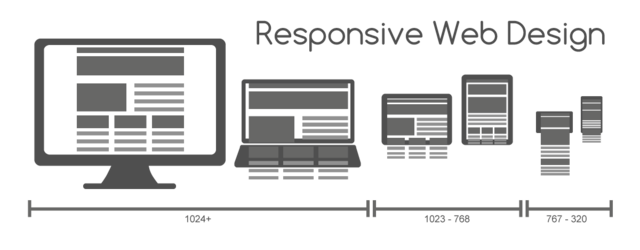
Earlier I said I was going to have a crack at making the theme I use for Pixieland a little more responsive and you know what? I actually did it.

Clunky and coarse, yes, but now if the page width drops below the previous minimum of 960px things will get out of the way and let the width drop sanely to the content minimum of 640px. It actually looks kind of OK too, though I’m sure I’ve missed some inevitable side-effects of being a bit over-zealous with the CSS selectors I’ve overridden.
Read More →


Having a poke at responsive web design

Responsive Web Design Banner

Responsive design. You can’t go anywhere on the internet without tripping over the term. And what a wonderful thing it is. Using modern CSS and Javascript techniques to let the same site reflow its content to fit different window sizes, growing and shrinking, showing and hiding as needed. It makes for some truly slick sites and, perhaps more importantly, reduces the maintenance effort by having less code and design to maintain since you no longer have to have separate sites for different sizes and devices – at least not to the same extent you’re used to.

But how does it work? That’s what I wanted to know, and this article is the fruits of my – admittedly lazy – research. A simple style sheet for a bare-bones responsive page.
Read More →