A few days ago I read about EyeQuant in an Ars Techinca article. EyeQuant, a Berlin-based startup, have developed and trained an AI they claim can tell you how clear your website it and what people will pay attention to. The company claim a number of success stories with big-name companies.
They charge a hefty monthly fee but also offer a free demo so I thought I’d give it a whirl.
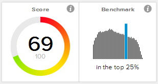 Plugging the (at the time of writing) front page of Pixieland into the app the the main thing I noted was a visual clarity score of 69%, putting Pixieland (and therefore the Chiron theme in general) in the top 25% of all websites analysed by EyeQuant. Not bad, not bad at all. EyeQuant is apparently measuring how clean things are, as well as flow and contrast. Of course the tool is aimed at eCommerce sites where calls-to-action and images are everything. Text suffers as a result and sites like Ars Technica can actually rate quite low. So it’s something of a surprise to find Pixieland rate well.
In addition to the clarity score the tool generates a number of visual reports:
- Perception map: “See what visitors will see in the first 3 seconds.”
- Attention map: “See in detail which elements of your design capture and command most attention.”
- Hot spots: “See the 10 most attention-grabbing spots of your design.”
- Regions of interest: “See exactly how visible a marked-up area is compared to your site’s average.”
- Visual clarity: “How clean, simple and clear is your design?”
Below is a gallery of the results and some analysis:
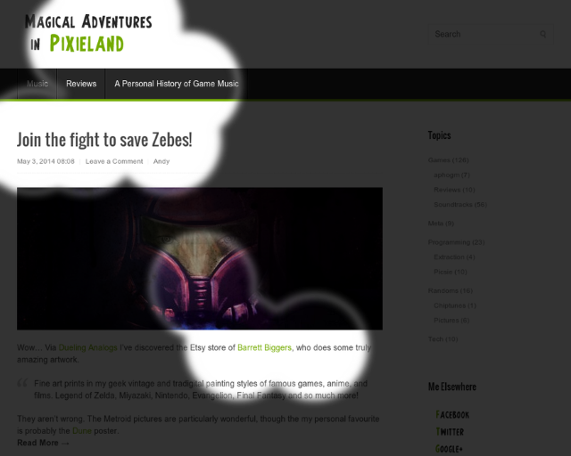
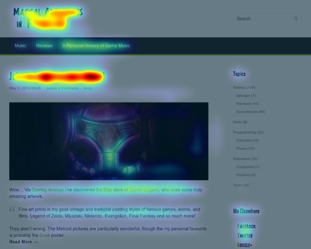
Engaged users: Perception map
What engaged users see in the first three seconds. Header, title and bits of the lead article.
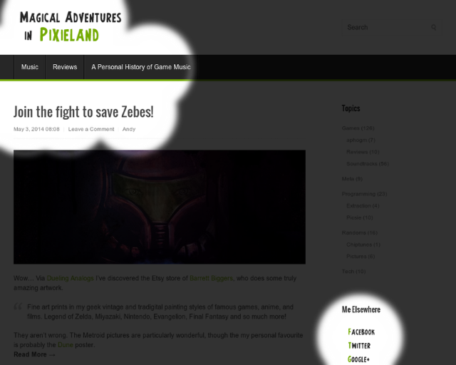
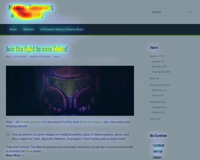
New users: Perception map
What new users see in the first three seconds. Pleasingly, eyes drawn to the social media buttons.
Engaged users: Attention map
Red areas grab the most attention.
New users: Attention map
More attention on the logo and title of the lead article

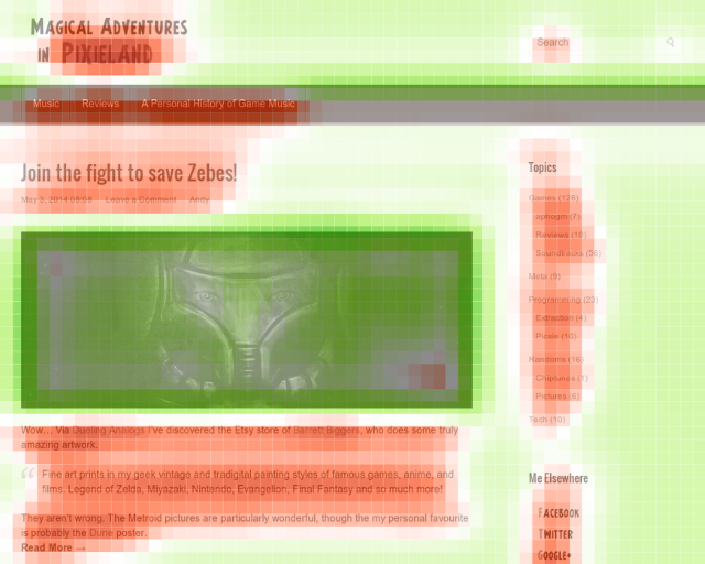
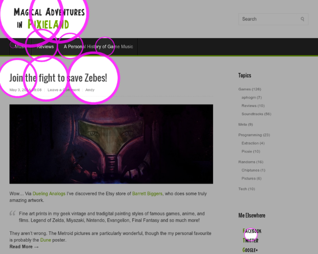
Engaged users: Visual clarity
Whitespace and images do well, text looks cluttered to the AI. Not unexpected, and shows the limitations of the tool outside of the target domain
New users: Visual clarity
No significant difference between new and engaged users.
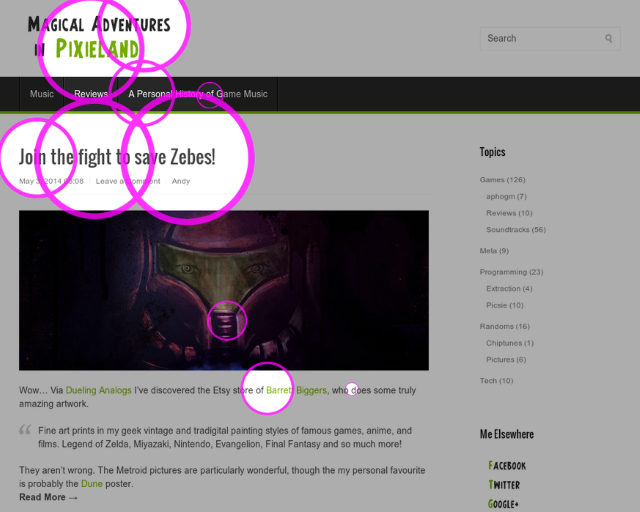
Engaged users: Hot spots
The logo and the lead story title are the most visible areas.
New users: Hot spots
New users focus even more on the branding and the lead title
Of course the tool and the marketing fluff that accompanies it set off all kinds of bullshit alarms, but the concept is a sound one and the training data seems valid. All in all though I’m pretty happy with how Chiron and Pixielad respond, especially considering the way the AI handles text, and it’s fascinating to see how people might be responding to the site. Not being able to afford (or warrant, obviously) user testing and eye-tracking experiments, this is probably the best data I’m going to get.
So what now?
The main take-home from this is to get rid of most of the sidebar. In none of the reports were the categories or links sections given any attention whatsoever. Removing them to give more prominence to the social media links seems like a sensible idea. Other than that, it looks like if I’m going to give an important link in a story it should be in the first couple of lines. That jives with something I already read elsewhere, and it’s nice to have some more evidence behind it. I’m no designer or UX guru, so I find this tool both encouraging and useful.