Tag Archives: Design

Add requirement. Repeat until original goal lost.

Camden Bench Banner

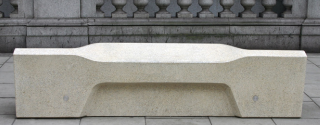
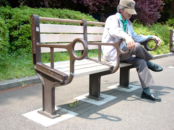
Right, time for a quick tangent from music, games, technology and programming. It’s design-related, don’t worry. Introducing the Camden Bench, quite possibly the nadir of seating and certainly a depressing symbol of modern life. Cities and councils have long since been using public seating designed to resist sleeping – bus stops with narrow, sloping seats that only mutant lizard people could find comfortable, benches with spikes or excessive arm rests. Hell, even metered seating. None of which is surprising given we live in a world where people can try to pass laws making it illegal to feed homeless people.

So against all that the Camden Bench looks positively tame. But let’s look at it from a design perspective shall we?
Read More →


Changing perceptions with an icon redesign

New wheelchair symbol

Icons and symbols surround us, digitally and physically, and we give the vast majority of them a vanishingly small amount of attention. By and large we know what they represent and what they mean. A recycle bin on your desktop. A stop sign on the road. They are ubiquitous to the point that we barely actually see them as actual visual images any more, simply a representation of a concept. We all know what a fire exit symbol looks like but could you actually draw one? Maybe, maybe not. Without looking could you describe the DVD-drive icon on your computer? Do you know what the colours each letter is in Google’s logo?

So, icons are everywhere and we barely see them on a conscious level. The argument then that common icons can actually colour our perceptions of what they represent might be met with scepticism. It’s an icon, it means what it means. Not necessarily. The Accessible Icon Project certainly don’t think so. They’ve been redesigning the ‘International Symbol of Access’ – the wheelchair symbol – with the explicit goal of altering people’s perception of it and those it represents.
Read More →